空响
Studio Void
2024
Brand Design
In the visual creation for "STUDIO VOID," we reinterpret the concepts of "void" (空) and "echo" (响)—not as physical emptiness and echo, but as the path of thinking and flow of consciousness generated by spatial designers in their projects. It is an exploration of the relationship between space, time, and people.
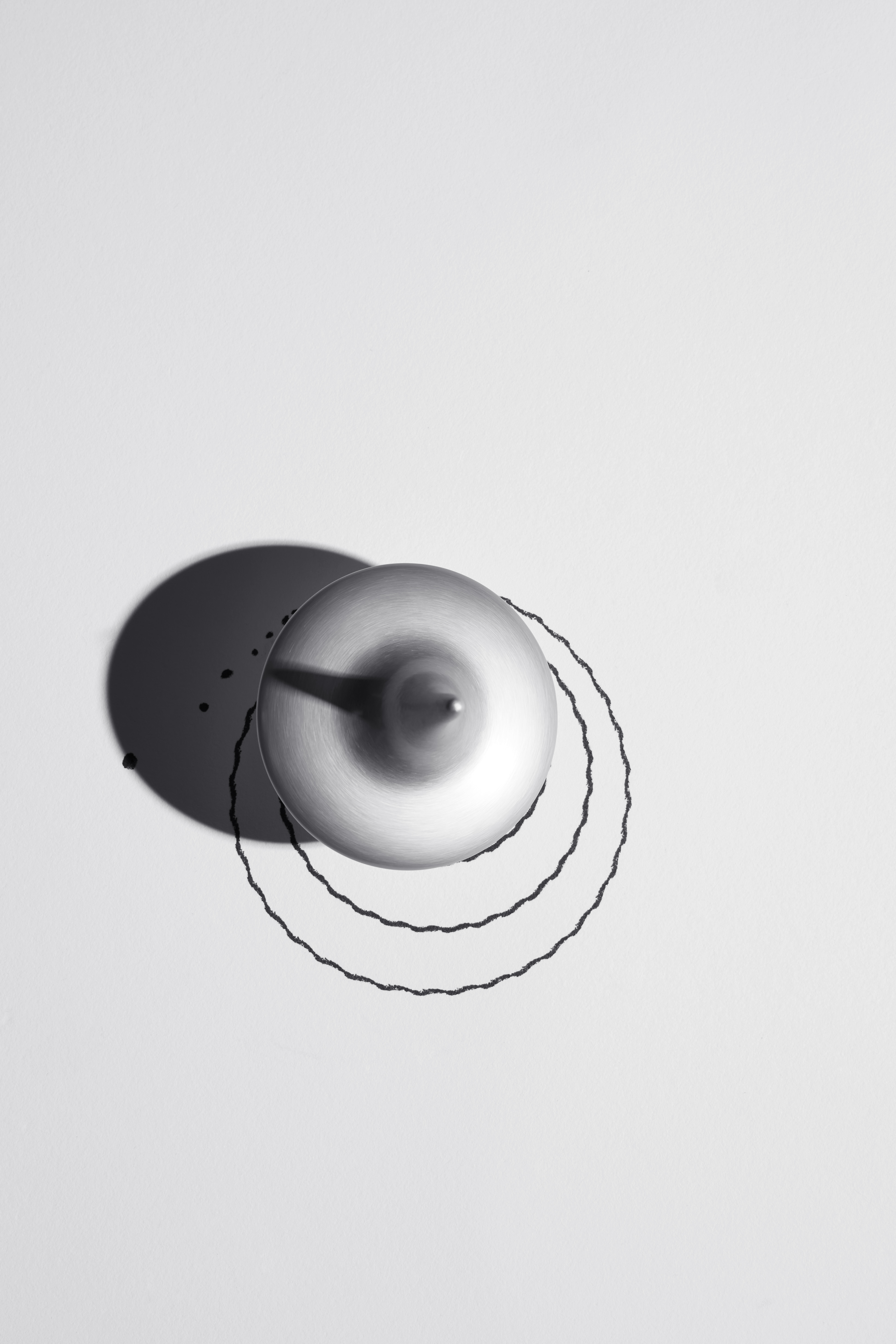
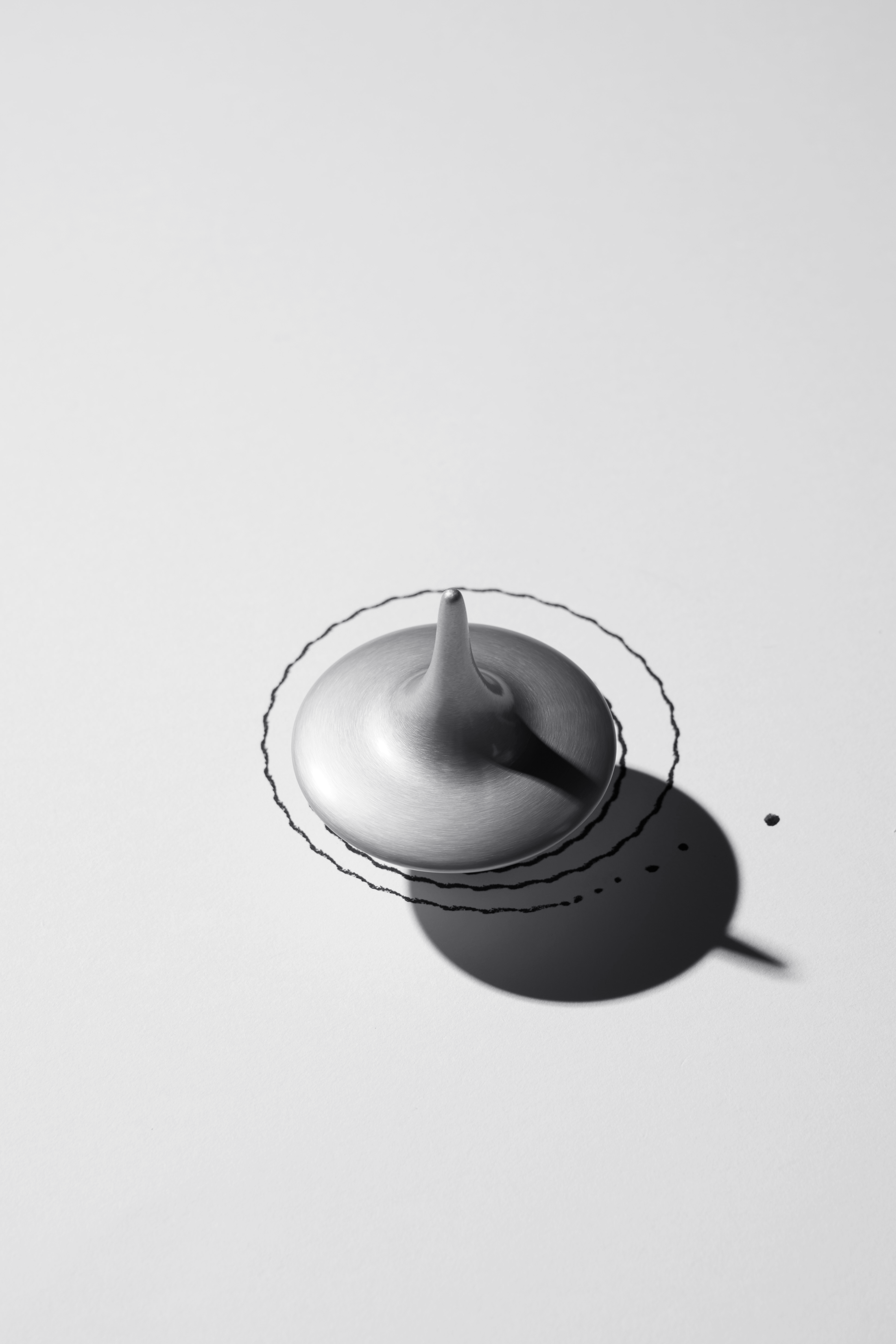
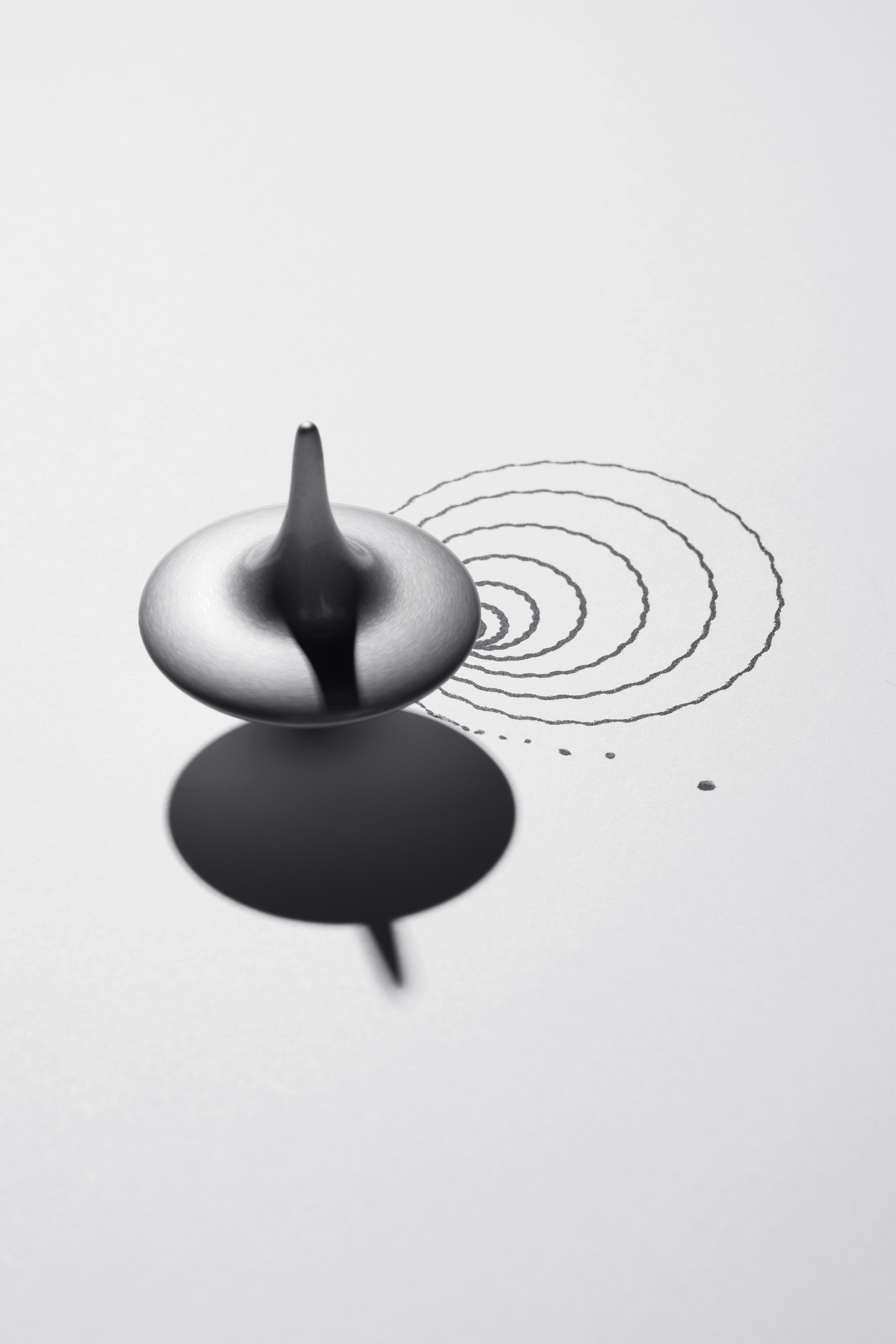
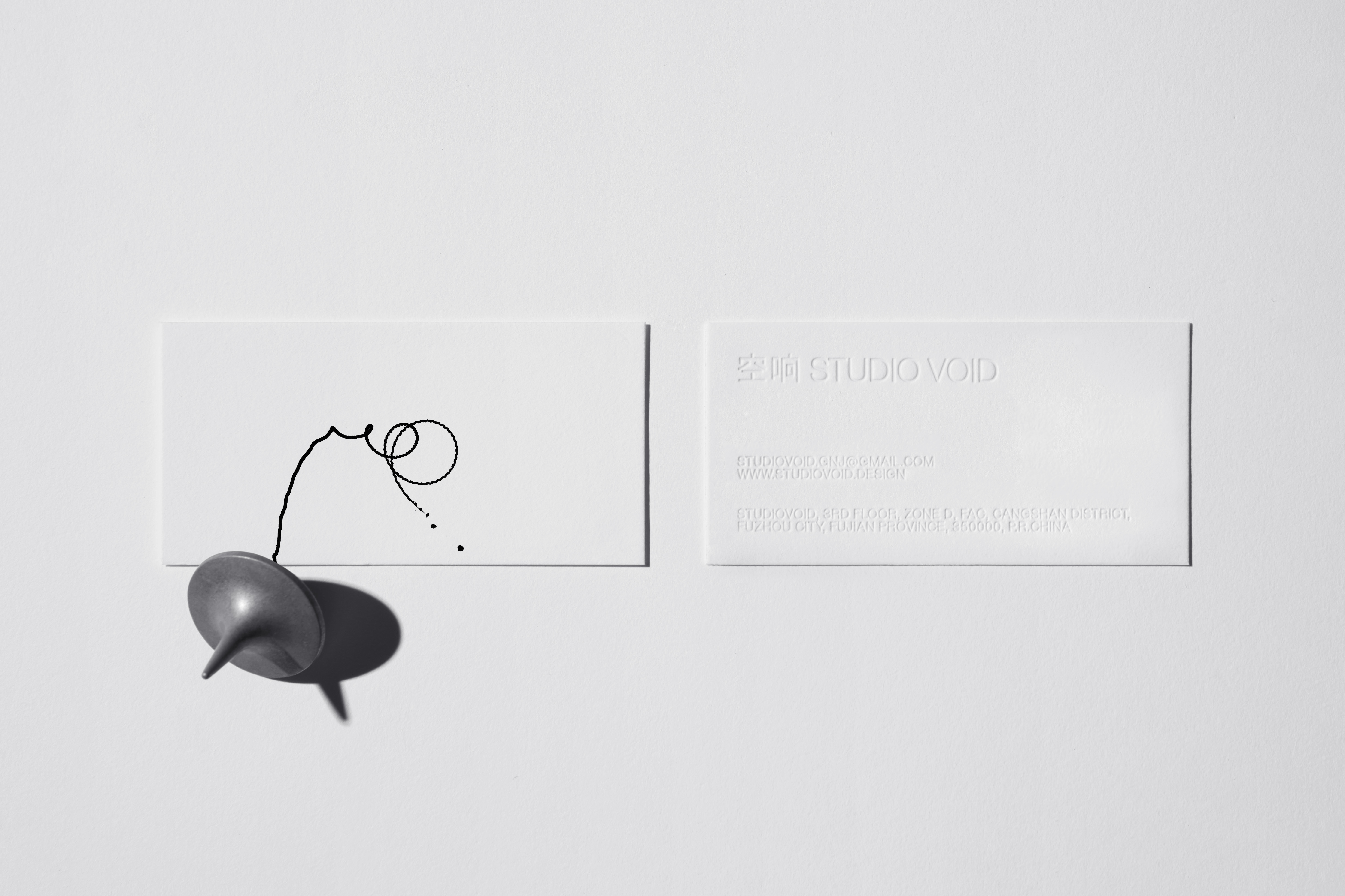
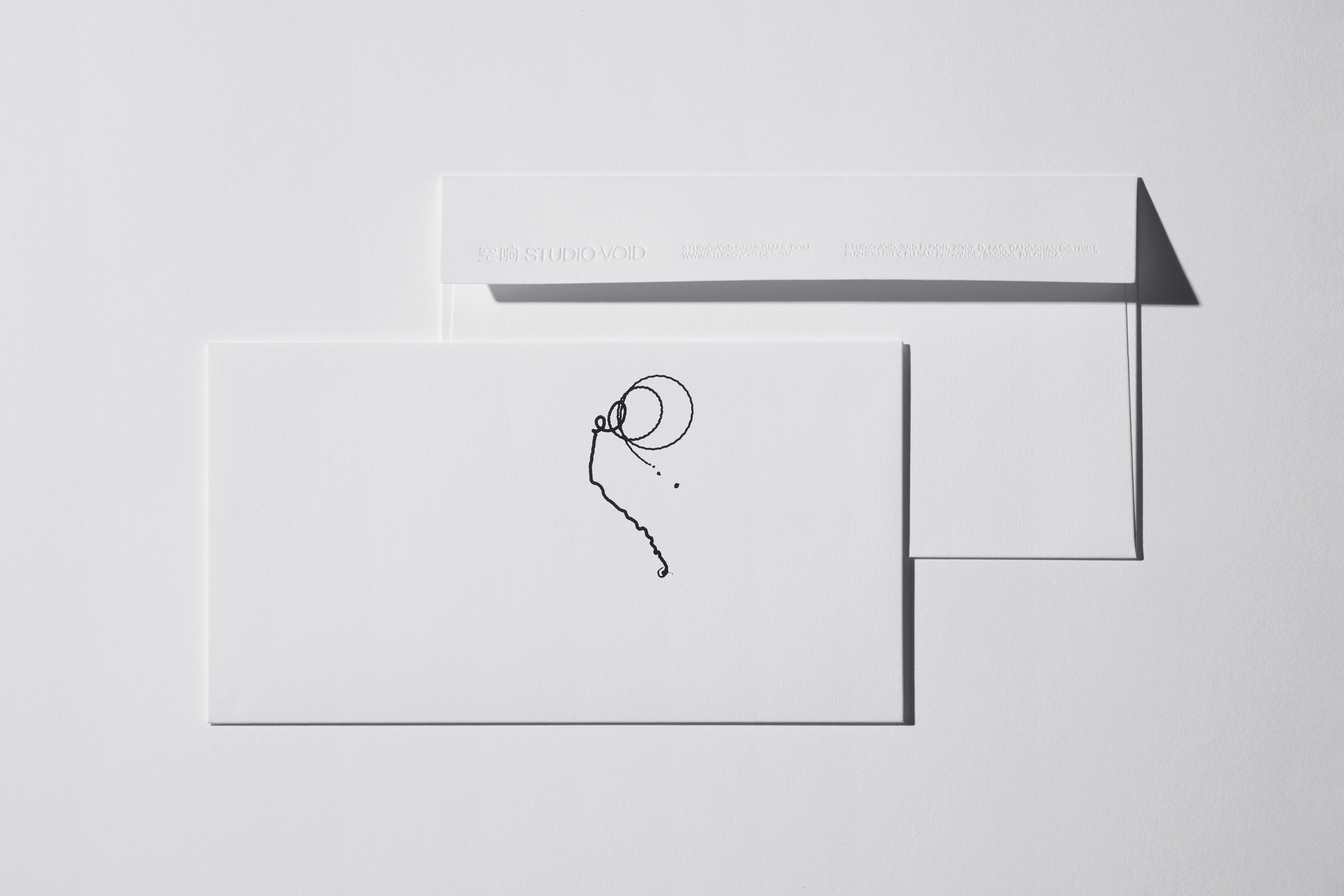
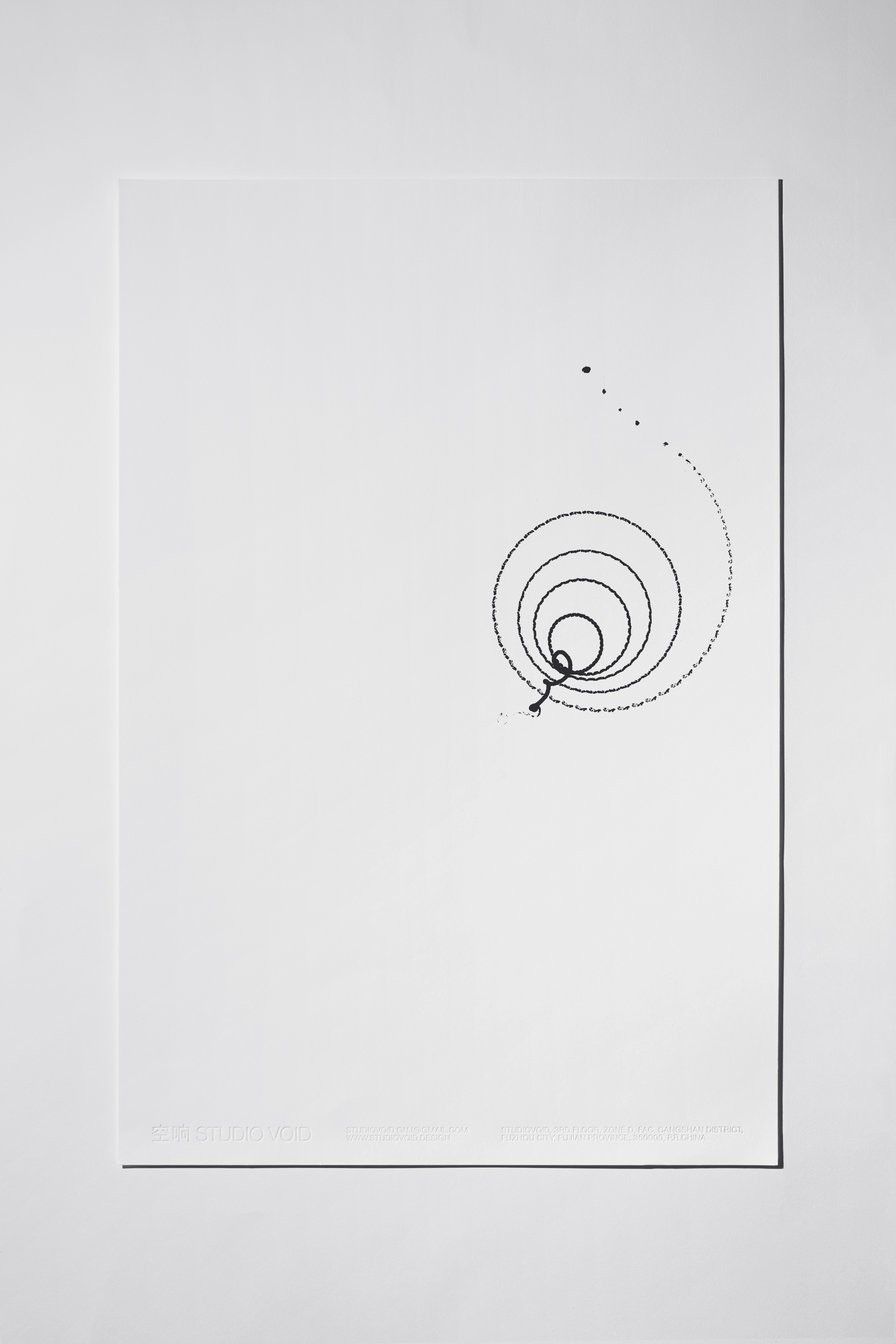
To make this "flowing thought" visible, we used spinning tops as a medium. Through 3D printing, we created spinning tops and experimented with embedding different pen cores inside. When set in motion by hand, they produced natural movement trajectories, building a connection between "object" and "field."
We sought to document these trajectories and unexpectedly discovered that even slight variations in the force or angle of each spin resulted in entirely different patterns. These forms were born from unrepeatable physical moments. The dynamic motion of the spinning tops transformed abstract design thinking into a coherent and memorable visual language.
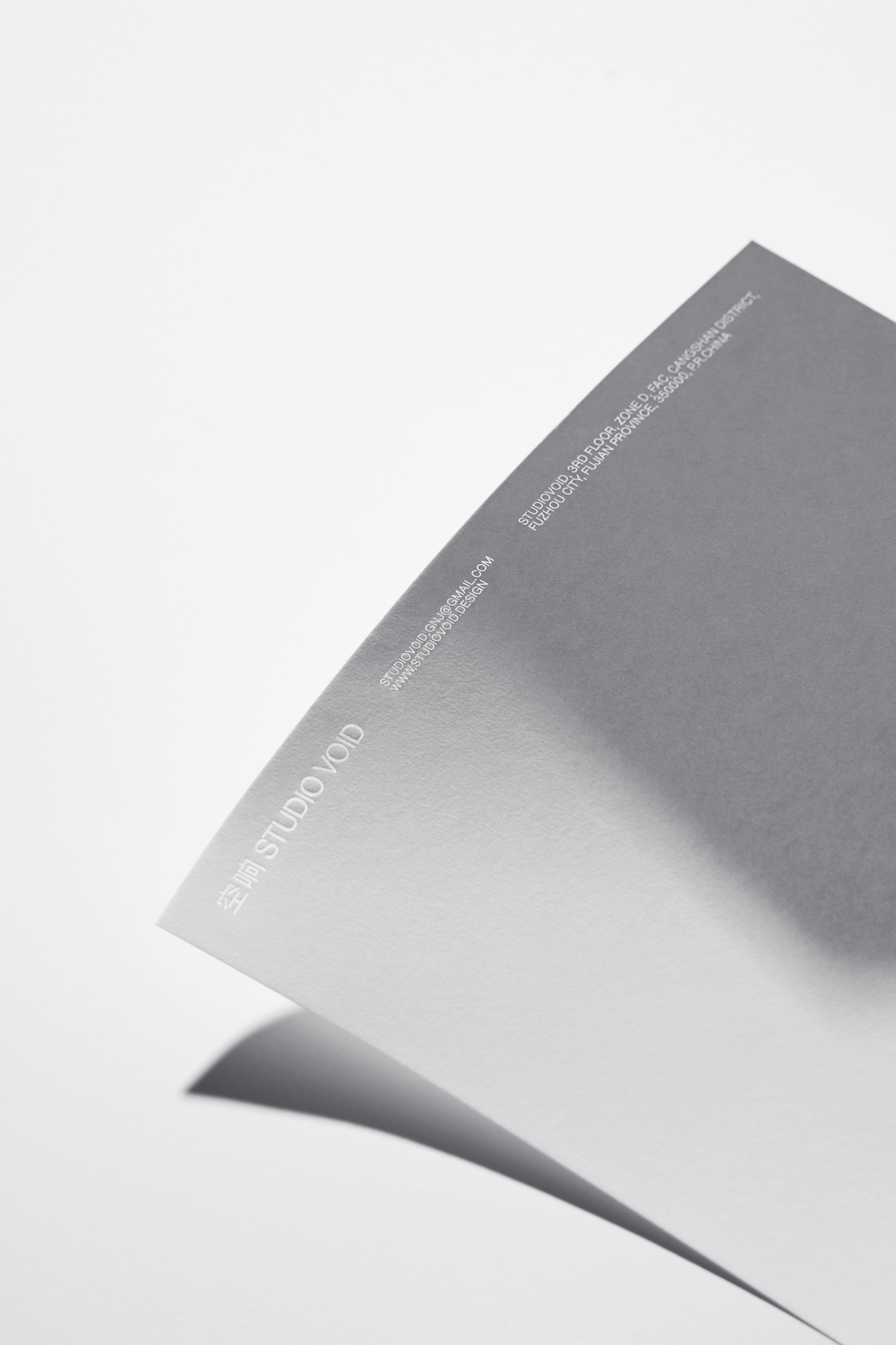
In terms of material selection, we chose Japanese Sakura Snow paper. Its delicate, snow-like texture, combined with debossing techniques, resembles faint footprints left on a snowy landscape. This not only reinforces the quiet and expansive atmosphere of "void" and "resonance" but also grounds the visual language in a tangible, tactile experience.
在 “STUDIO VOID 空响” 的视觉创作中,我们重新解读了 “空” 与 “响”—— 它并非物理意义上的空旷与回声,而是空间设计师在项目中所产生的思维的路径、意识的流动,更是对空间、时间和人三者关系的探索。
为了让这份 “流动的思维” 看得见,我们以陀螺为媒介,通过 3D 打印制作陀螺,反复试验着往里面嵌不同笔芯,通过人力转动,产生自然的运动轨迹,搭起了 “物”与 “场”的联系。
我们试着记录这些轨迹,过程中意外发现:每次抛转陀螺的力道、角度稍不一样,出现的轨迹就完全不同。这些形态诞生于不可复制的物理瞬间。而陀螺旋转的动态感,也让抽象的设计思考,变成了连贯又有记忆点的视觉语言。
物料选择上,我们选用了日本樱雪纸,它细腻得像积雪的质感,搭配压凹工艺,就像雪地上留下的轻浅足迹。既强化了 “空” 与 “响” 的静谧空旷意境,也让视觉语言在触觉上有了落点。
Designer_Bosen
Photographer_邹训楷
Producer_喜形印物
Client_Studio Void